

Taylor Swift album covers are more than simple artwork placed on the front of a record. Over the course of her career, they have become visual snapshots of different musical eras, reflecting changes in her sound, personality, storytelling, and creative direction. From the youthful country aesthetic of her early work to the polished pop imagery and understated visuals of her later albums, each cover tells a story before listeners even press play.
What makes Taylor Swift album covers especially interesting is how carefully they connect with the themes of their respective albums. Colors, photography, clothing, typography, locations, and even facial expressions often contribute to the larger narrative. Swift has built a reputation for creating albums that feel like complete worlds, and the artwork is an important part of that experience.
For longtime fans, looking at Taylor Swift album covers can feel like flipping through a visual diary. Each image brings back a particular period in her career and reminds listeners how dramatically her artistic identity has developed. Whether someone discovers her music through her earliest country records or through her more recent releases, the album artwork provides a fascinating way to understand that journey.
The Early Years of Taylor Swift Album Covers
Taylor Swift’s self-titled debut album introduced audiences to a young singer-songwriter with a distinctly country-inspired image. The cover presented a youthful and approachable version of Swift, matching the emotional honesty that became a defining part of her songwriting. The overall aesthetic felt natural rather than heavily manufactured, which suited the personal stories found throughout the album.
The artwork from this period is closely connected to Swift’s beginnings as a teenage songwriter. Her image was soft, recognizable, and relatively simple, allowing the focus to remain on her as an emerging artist. The album cover helped establish a visual identity that felt relatable to young listeners who connected with songs about first loves, friendship, heartbreak, and growing up.
With Fearless, the visual presentation became more polished while still maintaining the romantic and youthful spirit of Swift’s early career. The cover captured a sense of movement and optimism, reflecting an album filled with songs about love, dreams, uncertainty, and emotional discovery. It also helped establish the idea that each Swift album could have its own recognizable visual personality.
Speak Now and the Power of Storytelling
The Speak Now era marked another important stage in Swift’s evolution as an artist. The album’s cover leaned heavily into a dreamy, romantic atmosphere, creating the impression of a story unfolding in a world that was both familiar and slightly magical. The visual style complemented the album’s focus on personal experiences and emotionally detailed songwriting.
One of the most memorable aspects of this era was the connection between the album’s title and its visual presentation. Speak Now is an album about saying what you feel, taking emotional risks, and confronting moments that might otherwise remain unspoken. The cover artwork reinforced that sense of drama and individuality without becoming overly complicated.
The album also demonstrated how Swift was becoming increasingly intentional about her creative image. She was no longer simply presenting herself as a young country singer. Instead, she was developing a broader artistic identity built around storytelling, character development, and carefully constructed eras.
Red: A Major Shift in Taylor Swift’s Visual Identity
The Red album cover is often remembered as one of the most recognizable images in Taylor Swift’s discography. Its muted, vintage-inspired appearance captured the complicated emotions suggested by the album’s title. Red, as a color, can represent passion, anger, desire, heartbreak, and intensity, and those emotions are central to the record.
The cover’s styling also reflected Swift’s transition away from her earlier country image. By this point, her music was becoming more adventurous, incorporating elements of pop, electronic production, and other influences. The artwork communicated that change visually, giving fans a clear indication that they were entering a new phase.
The release of Red (Taylor’s Version) later introduced another opportunity to revisit that visual world. The updated project preserved the connection to the original era while adding a sense of reflection. This became an important part of Swift’s re-recording journey, as the new versions allowed fans to experience familiar music through a contemporary lens.
1989 and the Rise of the Polaroid Aesthetic
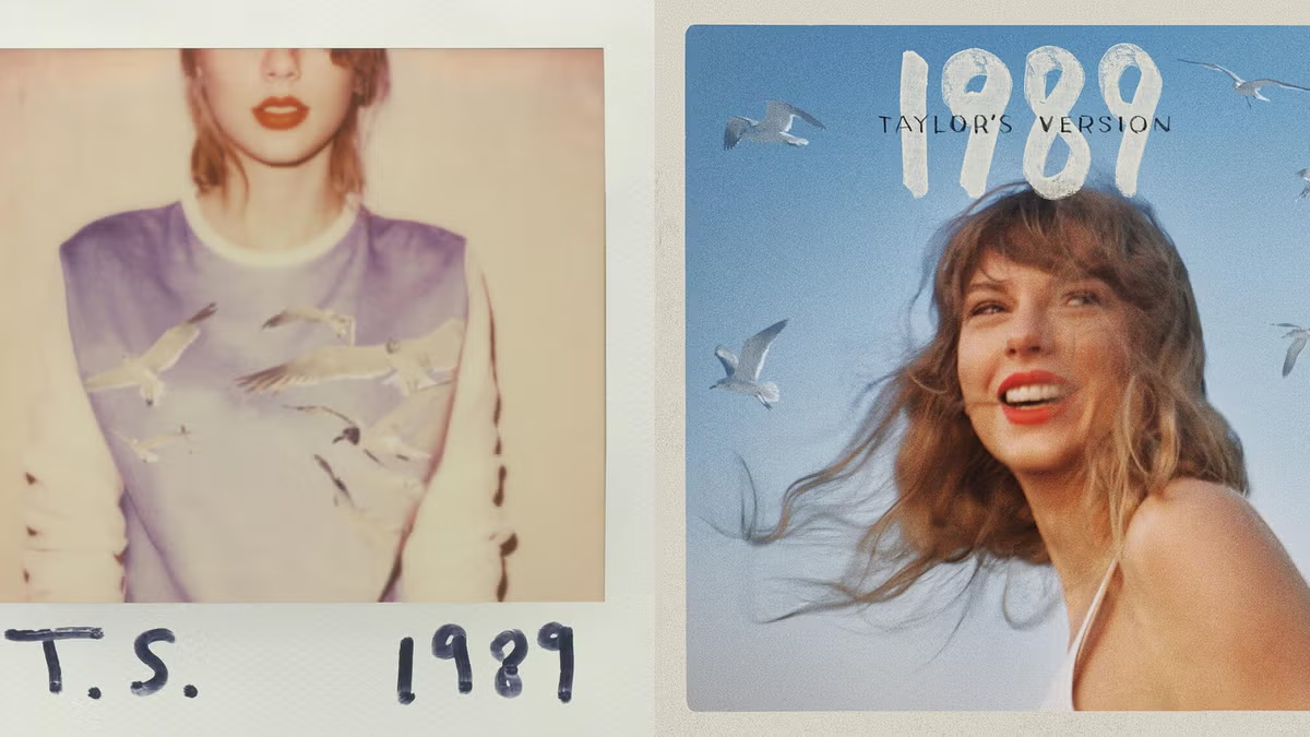
When 1989 arrived, Taylor Swift album covers took another dramatic turn. The cover featured a cropped portrait and a visual style inspired by photography, nostalgia, and urban life. The design felt intentionally different from her earlier albums, matching her full transition into mainstream pop.
The use of a Polaroid-inspired aesthetic became closely associated with the 1989 era. It created the feeling of a collection of personal memories captured in snapshots. This was particularly effective because the album itself explored themes of independence, relationships, new beginnings, and life in a fast-moving city.
The 1989 (Taylor’s Version) artwork continued the connection to the original concept while giving the era a refreshed appearance. The re-recording showed how Swift’s visual identity could be revisited without simply copying the past. Instead, the updated presentation suggested a mature perspective on a period that had already become a major chapter in her career.
Reputation: A Bold Reinvention
Few Taylor Swift album covers created as much anticipation as the artwork for Reputation. The era represented a significant departure from the polished, colorful pop image associated with 1989. Instead, Swift embraced darker imagery, newspaper-inspired typography, and a more confrontational visual language.
The cover immediately communicated that this was not going to be another straightforward pop album. The design suggested themes of public perception, media attention, criticism, and the complicated relationship between celebrities and their audiences. It matched the album’s more aggressive production and its exploration of reputation and identity.
At the same time, the visual world of Reputation was not only about anger or controversy. The album also contained deeply personal songs about love and finding emotional security. That contrast made the era particularly compelling. The cover represented the public side of Swift’s story, while the music often revealed a much more intimate reality underneath.
Lover and a Return to Color
After the darkness of Reputation, Lover introduced a completely different visual atmosphere. The album cover embraced bright pastel colors, dreamy photography, and a softer presentation. It felt like a deliberate emotional shift, suggesting openness, romance, optimism, and a willingness to celebrate love.
The artwork became instantly recognizable because of its unusual color palette and playful styling. The pastel clouds and vibrant visual choices helped create an atmosphere that felt almost surreal. This was a sharp contrast to the black-and-white imagery that had dominated the previous era.
The Lover cover also demonstrated Swift’s ability to use color as part of her storytelling. Rather than simply choosing an attractive photograph, the visual presentation contributed to the album’s emotional identity. The result was an era that felt bright and expressive, while still leaving room for more complicated songs about anxiety, politics, heartbreak, and self-reflection.
Folklore and the Beauty of Minimalism
Folklore represented one of the most dramatic changes in Taylor Swift album covers. Instead of bright colors or glamorous portraits, the artwork presented a black-and-white image with a distant, almost cinematic quality. The simplicity of the cover matched the album’s introspective sound and storytelling style.
The visual approach suggested isolation, nature, memory, and imagination. This made sense for an album that moved away from conventional autobiographical songwriting and explored fictional characters and interconnected stories. The cover felt less like a celebrity portrait and more like an image from an old film or an imagined world.
This minimalist approach was especially effective because it allowed listeners to project their own interpretations onto the artwork. There were no bright colors or obvious symbols telling audiences exactly what to think. Instead, the image created a mood, leaving the music to complete the picture.
Evermore and the Art of Quiet Storytelling
The cover of Evermore continued the stripped-back aesthetic introduced with Folklore, but it offered a slightly different emotional perspective. The image focused on Swift from behind, wearing a coat and looking out toward a natural landscape. The visual felt intimate, distant, and contemplative.
That choice was perfectly suited to an album built around atmospheric storytelling. Evermore continued exploring fictional characters and detailed narratives, but its mood often felt warmer and more reflective than the stark presentation of Folklore. The cover captured that sense of looking backward while also moving forward.
Together, the Folklore and Evermore covers demonstrated how powerful simplicity can be. Neither required an elaborate portrait or a complicated design. Instead, both relied on atmosphere and suggestion, proving that a memorable album cover does not always need to be visually loud.
Midnights and a New Kind of Intimacy
With Midnights, Swift returned to a more direct and recognizable portrait style. The cover featured a close-up image with a distinctive retro-inspired design, creating a sense of mystery and nostalgia. The album’s title and concept focused on thoughts that emerge during sleepless nights, and the artwork reflected that introspective theme.
The visual identity of Midnights was different from both the bright world of Lover and the monochromatic atmosphere of Folklore. It combined elements of vintage photography, nighttime reflection, and modern pop aesthetics. The result was a cover that felt personal without being overly literal.
The artwork also helped establish Midnights as a cohesive visual era. From its promotional materials to its various editions and alternate covers, the project showed how album packaging could become part of a larger creative experience. Fans were encouraged to explore different versions while still recognizing the central identity of the record.
The Tortured Poets Department and a More Mature Aesthetic
The Tortured Poets Department introduced another visual shift in Swift’s artistic journey. Its cover adopted a monochromatic, editorial-inspired aesthetic that felt emotionally exposed and deliberately restrained. Rather than presenting a bright or glamorous image, the artwork created a mood of vulnerability and reflection.
The visual language fit an album concerned with complicated emotions, relationships, creative identity, and the aftermath of intense experiences. The black-and-white presentation gave the project a timeless quality while also emphasizing the seriousness of its themes.
What makes the cover especially interesting is how it fits into Swift’s broader pattern of visual reinvention. Throughout her career, she has repeatedly found new ways to present herself without losing the storytelling instincts that have always been central to her work.
Why Taylor Swift Album Covers Matter to Fans
Taylor Swift album covers matter because they help define the eras surrounding her music. For fans, an album is often more than a collection of songs. It can represent a specific period of life, and the cover becomes a visual symbol of the memories associated with that time.
The artwork also encourages fans to pay attention to details. Photography choices, colors, clothing, typography, and recurring themes can all become subjects of discussion and interpretation. Swift’s audience is known for analyzing clues and connections, so album artwork naturally becomes part of the larger conversation surrounding each release.
There is also a sense of nostalgia attached to the covers. Looking at an early album image can remind listeners where they were when they first heard those songs. In that way, the covers become personal landmarks, not just promotional materials.
The Evolution of Taylor Swift Through Her Album Covers
When viewed together, Taylor Swift album covers create a visual timeline of an artist who has never been afraid to change. The early country-inspired artwork gradually gave way to polished pop imagery, darker reinvention, pastel romance, minimalist storytelling, and more introspective visual styles.
Each era has its own personality, but there are also common threads running through the entire collection. Storytelling remains at the center. Whether the cover is colorful and playful or dark and restrained, it usually invites the audience to wonder what story lies beneath the surface.
That is perhaps the greatest strength of Swift’s album artwork. The covers do not exist separately from the music. They help establish the atmosphere, introduce the emotional world of the album, and give listeners a visual entry point into the stories that follow.
Final Thoughts on Taylor Swift Album Covers
Taylor Swift album covers offer a fascinating look at how a successful musician can use visual art to expand the meaning of her music. Across multiple eras, Swift has consistently treated album artwork as part of the creative process rather than an afterthought.
From the youthful charm of her early records to the bold reinvention of Reputation and the quiet storytelling of Folklore and Evermore, each cover reflects a different chapter. The changes in photography, color, styling, and design mirror the evolution of her songwriting and musical ambitions.
Ultimately, the lasting appeal of Taylor Swift album covers comes from the way they capture moments in time. They help listeners recognize different eras, remember personal experiences, and understand the artistic choices behind the music. Whether someone is a longtime fan or a casual listener, exploring these covers provides an entertaining way to trace the remarkable visual and musical journey of one of the most influential singer-songwriters of her generation.