

When people search for taylor swift album covers, they are often looking for more than a collection of attractive photographs. Taylor Swift has turned album artwork into an important part of her storytelling, using colours, clothing, photography, typography, and visual symbolism to create a world around each record. Her covers have changed dramatically throughout her career, reflecting the different musical eras and personal themes associated with her work.
From the youthful country-pop aesthetic of her early releases to the muted nostalgia of folklore and the dreamy glamour of Midnights, each cover gives listeners a visual introduction to the music inside. Some are bright and romantic, others are mysterious and understated, while a few deliberately feel raw and imperfect. Together, they form a visual timeline of one of the most influential songwriting careers in modern pop music.
Why Taylor Swift Album Covers Matter So Much
Album covers have always been an important part of music culture, but they have become even more significant in the streaming era. When listeners discover an album online, the artwork is often one of the first things they see. For an artist like Taylor Swift, the cover can help establish the mood before the first song even begins. It becomes the visual doorway into the story she wants to tell.
The appeal of taylor swift album covers comes partly from their consistency within individual eras. Swift does not simply release a record with a random photograph attached to it. Her visual choices are usually connected to the themes, emotions, and musical direction of the project. A particular colour palette or photographic style can immediately make fans think of a specific period in her career.
Her album artwork also encourages fan discussion and interpretation. Fans regularly examine backgrounds, outfits, objects, fonts, and seemingly small details for possible connections to lyrics or broader themes. Whether every detail is intentional or not, the artwork gives listeners another layer through which to experience the music.
Taylor Swift Album Covers and Her Country Beginnings
Taylor Swift’s self-titled debut album introduced the public to a young artist with a distinctly country-inspired image. The cover presented her as a fresh-faced singer-songwriter, with a visual style that matched the youthful optimism of the music. It was simple compared with some of her later artwork, but that simplicity suited the beginning of her career.
The cover of Fearless continued to develop that image while introducing a stronger sense of movement and confidence. The visual presentation felt youthful and energetic, complementing an album filled with songs about romance, growing up, uncertainty, and hope. The title itself became closely connected to the era’s overall message of embracing life despite the possibility of disappointment.
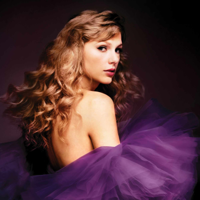
With Speak Now, the visual identity became more theatrical and mature. The cover featured Swift in a purple dress, captured in a moment that suggested movement and transformation. Purple became strongly associated with the era, and the artwork reflected the album’s focus on personal storytelling and emotional honesty.
These early covers are important because they show how Swift gradually developed her visual language. She began with an image that reflected her country roots and youthful personality, then slowly moved toward more carefully constructed concepts that would become a defining feature of her career.
The Romantic and Polished Look of Red
The Red era marked a significant turning point in Taylor Swift’s career. Musically, the album explored a wider range of sounds, and the cover reflected that transition. The image was close-up and deliberately understated, with Swift’s face partially hidden beneath a hat and red lipstick providing a strong visual focal point.
The colour red carried obvious symbolic weight. Throughout the album, Swift explored intense emotions such as passion, heartbreak, anger, nostalgia, and longing. The colour therefore became a natural visual representation of the emotional extremes explored in songs such as “All Too Well” and “I Knew You Were Trouble.”
The artwork for Red (Taylor’s Version) retained the central visual concept while giving it a refreshed appearance. The re-recorded album also demonstrated how powerful Swift’s visual branding had become. Fans could immediately recognise the connection between the original record and its updated version, while the subtle changes signalled that this was a new chapter in the story.
The Clean Pop Aesthetic of 1989
The transition to 1989 represented one of the biggest creative changes in Swift’s career. The album moved decisively into pop, and the cover reflected the record’s sleek, modern personality. The original artwork used a Polaroid-inspired photograph that showed only part of Swift’s face, creating an intentionally incomplete and slightly mysterious image.
The design felt nostalgic while still being contemporary. Polaroid photography has a strong connection to memories and snapshots of everyday life, which worked particularly well with an album that explored relationships, independence, reinvention, and city life. The cover did not explain everything at first glance, which encouraged curiosity.
The 1989 (Taylor’s Version) artwork maintained the connection to the original while offering a new perspective. Like the other re-recorded albums, it showed how Swift could revisit an established visual identity without simply repeating it. The updated artwork became part of a broader project that combined nostalgia with artistic ownership.
Reputation and a Dramatic Change in Direction
Few taylor swift album covers created as immediate a contrast with previous work as Reputation. After the bright, polished world of 1989, Swift adopted a much darker and more confrontational visual identity. The cover used a black-and-white portrait with newspaper-style typography, signalling a dramatic departure from her earlier aesthetic.
The design was closely tied to the themes surrounding the album. Reputation examined celebrity, public perception, media attention, love, vulnerability, and the experience of being misunderstood. The newspaper-inspired text visually referenced the constant public conversation surrounding Swift, making the cover feel like a statement about fame itself.
At the same time, the artwork was not simply about anger or controversy. The album’s darker exterior eventually gave way to deeply personal songs about intimacy and trust. The contrast between the aggressive visual branding and the more private emotional moments inside the record became one of the era’s most interesting creative features.
The Soft and Dreamy World of Lover
After the darkness of Reputation, Swift moved in an entirely different direction with Lover. The album cover featured pastel colours and a dreamy, almost surreal atmosphere. The use of pink, blue, and other soft tones immediately suggested a warmer and more playful era.
The cover’s visual style matched the album’s exploration of love in its many forms. While Lover contains romantic songs, it also addresses friendship, personal growth, anxiety, politics, and the complicated realities of relationships. The colourful artwork created a sense of openness that contrasted sharply with the guarded image associated with the previous era.
The design also became instantly recognisable. The pastel aesthetic appeared throughout promotional material, music videos, performances, and merchandise. It demonstrated Swift’s ability to create a complete visual world around an album rather than treating the cover as an isolated piece of artwork.
Folklore and the Power of Minimalism
The arrival of folklore in 2020 surprised many fans. Released with little traditional promotional build-up, the album introduced a stripped-back musical and visual identity. The cover showed Swift in a black-and-white photograph, standing alone in a misty forest.
Compared with the colourful artwork of Lover, the cover of folklore was remarkably restrained. There were no bright colours or elaborate styling choices competing for attention. Instead, the image created a feeling of distance, solitude, and mystery. It perfectly suited an album built around storytelling, fictional characters, memory, and introspection.
The artwork also helped establish folklore as a distinct creative universe. The forest became an important visual symbol associated with the album, while the monochrome photography reinforced its nostalgic and atmospheric personality. The cover felt less like a traditional pop-star portrait and more like the front of a novel.
Evermore and a Continued Sense of Mystery
Evermore continued the storytelling approach introduced by folklore, but its cover offered a slightly different perspective. Instead of showing Swift’s face, the artwork presented the back of her head as she looked toward a landscape. Her coat, hair, and surroundings created an image that felt intimate but distant.
The cover’s composition reflected the album’s themes of reflection and observation. Much of evermore explores stories that are not necessarily autobiographical in a direct sense, allowing Swift to experiment with characters and perspectives. The artwork similarly invites the viewer to look outward rather than directly at the artist.
The earthy colours and textured clothing also created a strong connection with the rustic atmosphere associated with the record. It was another example of Swift using relatively simple photography to communicate a surprisingly rich emotional mood.
The Dreamy Nostalgia of Midnights
Midnights introduced another major shift in Swift’s visual identity. The cover used a retro-inspired design featuring a close-up photograph and bold typography. The overall presentation felt simultaneously modern and nostalgic, reflecting the album’s concept of sleepless nights and private thoughts.
The visual identity of Midnights was especially memorable because it incorporated design elements that felt inspired by vintage records and photography. The cover’s layout was distinctive, and the imagery created a sense of late-night introspection. It suggested a world where memories, regrets, fantasies, and anxieties become louder when everything else is quiet.
The album also expanded the idea of multiple versions and alternative artwork. Different editions allowed Swift to explore variations within the same creative universe, giving fans additional visual interpretations of the project. This approach became an important part of the modern album-collecting experience.
Taylor Swift Album Covers and the Art of Reinvention
Looking across taylor swift album covers, one of the clearest patterns is constant reinvention. Swift has rarely allowed one visual identity to define her entire career. Instead, she has repeatedly changed her approach to match the musical and emotional direction of each album.
The progression from country-inspired photography to polished pop, dark typography, pastel dreamscapes, monochrome forests, and retro-inspired designs reveals an artist who understands the importance of visual storytelling. Each era has its own personality, and the album cover often serves as the first introduction to that personality.
What makes the evolution particularly interesting is that Swift’s artwork rarely feels completely disconnected from her previous work. There are often subtle links between eras, whether through recurring colours, visual motifs, or themes of memory and identity. This creates a larger narrative across her discography while still allowing each album to stand on its own.
Why Fans Continue to Collect and Discuss the Covers
For many fans, Taylor Swift’s album covers are not simply digital thumbnails on a streaming service. Physical editions, special releases, vinyl records, CDs, and alternate versions have turned the artwork into something that can be collected and displayed. The visual presentation has therefore become part of the experience of owning an album.
Fans also enjoy comparing different editions and identifying connections between artwork and lyrics. Online communities often discuss possible meanings behind specific photographs, colour choices, and design elements. This level of engagement has helped turn album artwork into an ongoing conversation rather than a one-time promotional tool.
There is also a strong nostalgic quality to collecting physical music. In an age when albums can be streamed instantly, owning a physical record with carefully designed artwork can feel more personal. Swift’s attention to visual presentation has helped maintain that connection between music and physical design.
The Lasting Legacy of Taylor Swift Album Covers
Ultimately, taylor swift album covers tell a story of artistic growth. They document the evolution of a singer-songwriter who began with a youthful country image and gradually developed into a global pop and cultural figure capable of moving between genres and visual styles.
Each cover offers a different entry point into the corresponding album. Some are immediately striking, while others reveal their appeal more slowly. Some focus on colour and glamour, while others depend on atmosphere and simplicity. Yet all of them contribute to a larger visual history.
That is why Taylor Swift’s album artwork remains such a popular topic among fans and music audiences. The covers are not merely packaging. They are part of the storytelling process, helping define the identity of each era and giving listeners a visual memory to associate with the music. When viewed together, they create a fascinating portrait of reinvention, creativity, and the changing relationship between an artist and her audience.